---
title: "Publication-ready ggplot2 figures with theme_publication()"
description: "Build a complete publication-ready ggplot2 theme from scratch, demonstrating the Okabe-Ito colorblind-safe palette, dual PDF/PNG export, and consistent styling across all figure types used in this site."
author: "Raban Heller"
date: 2026-05-08
date-modified: 2026-05-08
categories:
- visualization-and-communication
- ggplot2
- theme
- colorblind-safe
keywords: ["ggplot2", "publication-ready", "Okabe-Ito", "colorblind", "theme", "visualization"]
labels: ["visualization", "reproducible-style"]
tier: 1
bibliography: ../../../references.bib
vgwort: "TODO_VGWORT_visualization-and-communication_publication-ready-ggplot-theme"
image: thumbnail.png
image-alt: "Four-panel showcase of publication-ready ggplot2 figures using the Okabe-Ito palette"
citation:
type: webpage
url: https://r-heller.github.io/equilibria/tutorials/visualization-and-communication/publication-ready-ggplot-theme/
license: "CC BY-SA 4.0"
draft: false
has_static_fig: true
has_interactive_fig: true
has_shiny_app: false
---
```{r}
#| label: setup
#| include: false
library(ggplot2)
library(dplyr)
library(tidyr)
library(plotly)
```
## Introduction & motivation
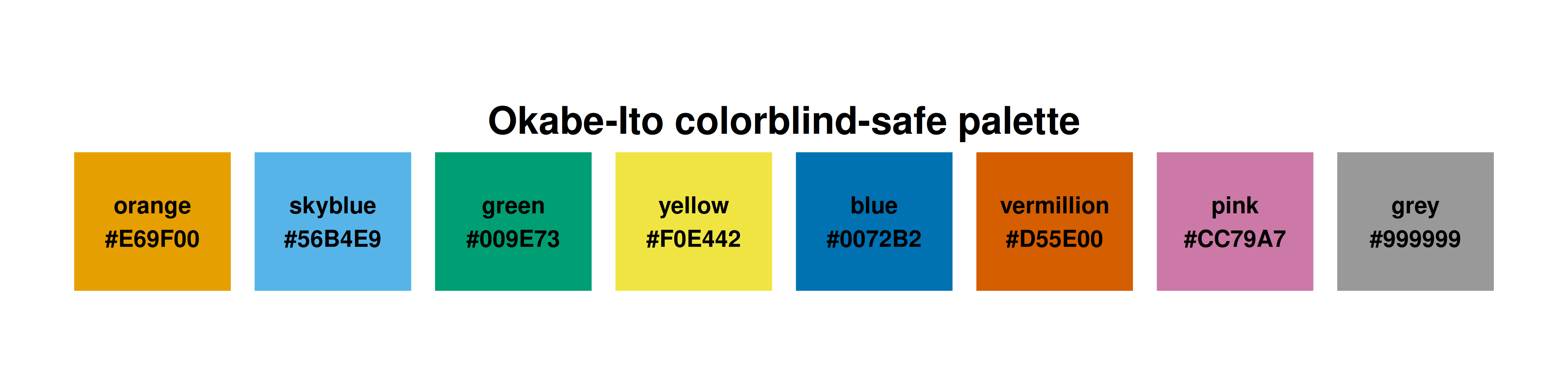
Every figure on this site follows a consistent visual language: the Okabe-Ito colourblind-safe palette, a clean minimal theme, dual PDF+PNG export at 300 DPI, and carefully considered typography. This is not mere aesthetics — it is a design discipline that ensures figures are readable by everyone (including the roughly 8% of men with colour vision deficiency), reproducible across rendering environments, and suitable for both web display and print publication. The Okabe-Ito palette was proposed by Masataka Okabe and Kei Ito specifically for scientific visualization: its eight colours are maximally distinguishable under all three common forms of colour vision deficiency (protanopia, deuteranopia, tritanopia) as well as in greyscale print. Building a custom ggplot2 theme that encapsulates these choices means every collaborator and every article starts from the same visual baseline — no ad hoc colour choices, no inconsistent font sizes, no missing axis labels. This tutorial builds `theme_publication()` step by step, demonstrates it on four common figure types (scatter plot, bar chart, line plot, heatmap), shows how to integrate it with plotly for interactive output, and explains the export pipeline that produces both high-resolution PNG (for web) and vector PDF (for print) from a single code chunk.
## The Okabe-Ito palette
```{r}
#| label: okabe-ito-palette
# The 8-colour Okabe-Ito palette
okabe_ito <- c(
  orange    = "#E69F00",
  skyblue   = "#56B4E9",
  green     = "#009E73",
  yellow    = "#F0E442",
  blue      = "#0072B2",
  vermillion = "#D55E00",
  pink      = "#CC79A7",
  grey      = "#999999"
)

# Display the palette
palette_df <- tibble(
  color = names(okabe_ito),
  hex = unname(okabe_ito),
  index = seq_along(okabe_ito)
)

cat("Okabe-Ito palette (8 colours, colorblind-safe):\n")
print(palette_df)
```
```{r}
#| label: fig-palette-swatch
#| fig-cap: "The Okabe-Ito colorblind-safe palette. All eight colours are distinguishable under protanopia, deuteranopia, and tritanopia, as well as in greyscale reproduction."
#| dev: [png, pdf]
#| fig-width: 8
#| fig-height: 2
#| dpi: 300
ggplot(palette_df, aes(x = index, y = 1, fill = hex)) +
  geom_tile(width = 0.9, height = 0.8, color = "white", linewidth = 1) +
  geom_text(aes(label = paste0(color, "\n", hex)), size = 3, fontface = "bold") +
  scale_fill_identity() +
  coord_fixed(ratio = 1) +
  labs(title = "Okabe-Ito colorblind-safe palette") +
  theme_void() +
  theme(plot.title = element_text(size = 14, face = "bold", hjust = 0.5))
```
## Building theme_publication()
```{r}
#| label: theme-definition
theme_publication <- function(base_size = 12) {
  theme_minimal(base_size = base_size) +
    theme(
      # Title hierarchy
      plot.title = element_text(size = base_size * 1.2, face = "bold",
                                 margin = margin(b = 5)),
      plot.subtitle = element_text(size = base_size * 0.9, color = "grey40",
                                    margin = margin(b = 10)),
      plot.caption = element_text(size = base_size * 0.7, color = "grey50",
                                   hjust = 0),

      # Axes
      axis.line = element_line(color = "grey30", linewidth = 0.3),
      axis.title = element_text(size = base_size * 0.95),
      axis.text = element_text(size = base_size * 0.85, color = "grey30"),
      axis.ticks = element_line(color = "grey30", linewidth = 0.2),

      # Grid
      panel.grid.major = element_line(color = "grey90", linewidth = 0.2),
      panel.grid.minor = element_blank(),

      # Legend
      legend.position = "bottom",
      legend.title = element_text(size = base_size * 0.9, face = "bold"),
      legend.text = element_text(size = base_size * 0.8),

      # Margins
      plot.margin = margin(10, 10, 10, 10),

      # Strip (for facets)
      strip.text = element_text(size = base_size * 0.95, face = "bold",
                                 margin = margin(b = 5))
    )
}

# Convenience scale functions
scale_fill_okabe_ito <- function(...) {
  scale_fill_manual(values = unname(okabe_ito), ...)
}

scale_colour_okabe_ito <- function(...) {
  scale_colour_manual(values = unname(okabe_ito), ...)
}

cat("theme_publication() defined with:\n")
cat(" - Base: theme_minimal\n")
cat(" - Bold title, grey subtitle, left-aligned caption\n")
cat(" - Thin axis lines, no minor gridlines\n")
cat(" - Bottom legend, bold legend title\n")
cat(" - Bold facet strip labels\n")
```
## Showcase: four figure types
### Scatter plot
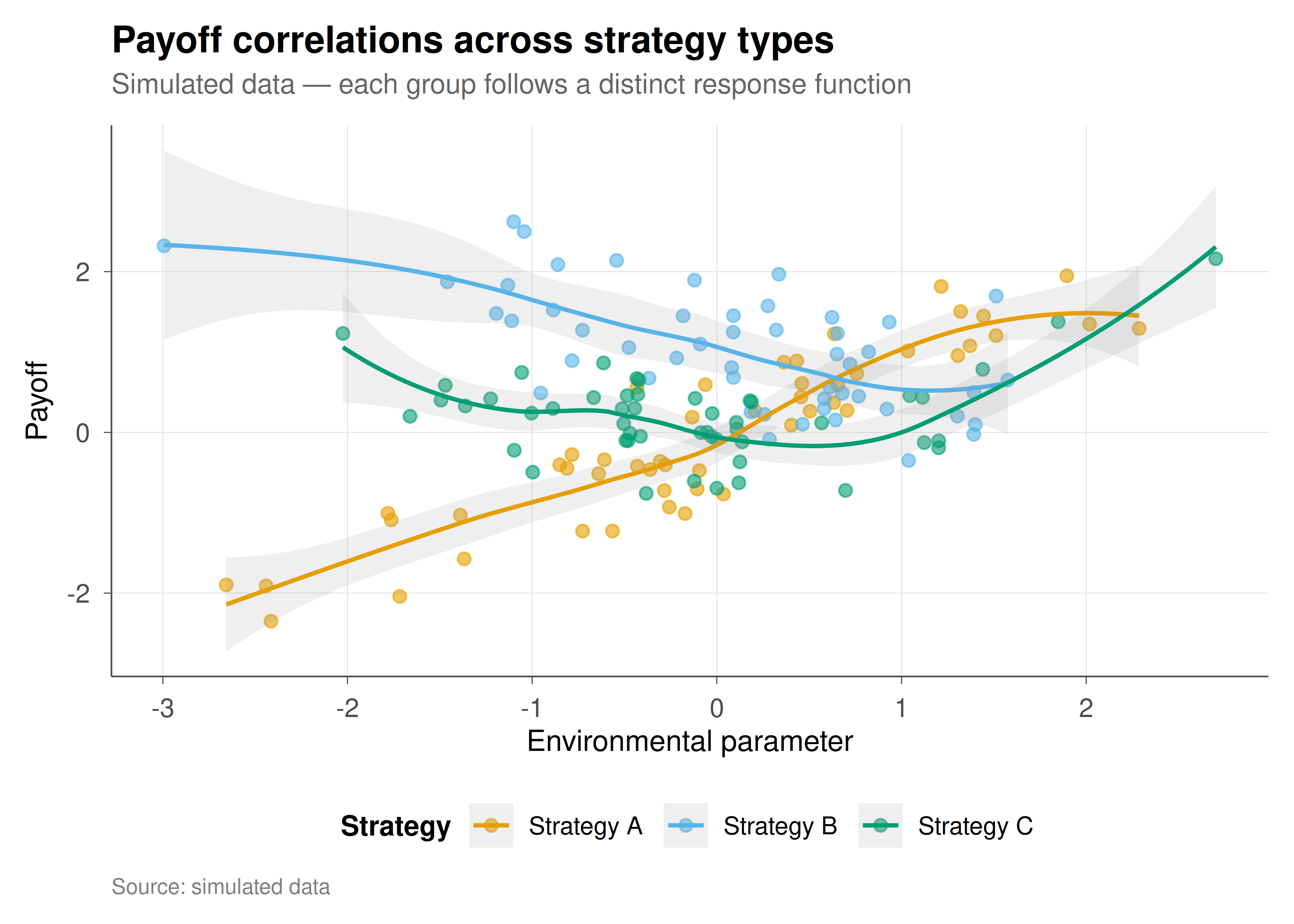
```{r}
#| label: fig-scatter-showcase
#| fig-cap: "Figure 1. Scatter plot with theme_publication() and Okabe-Ito palette. Demonstrates point shapes, colour mapping, smooth trend lines, and annotation placement."
#| dev: [png, pdf]
#| fig-width: 7
#| fig-height: 5
#| dpi: 300
set.seed(42)
scatter_data <- tibble(
  x = rnorm(150),
  group = rep(c("Strategy A", "Strategy B", "Strategy C"), each = 50)
) |>
  mutate(y = case_when(
    group == "Strategy A" ~ 0.8 * x + rnorm(150, 0, 0.5),
    group == "Strategy B" ~ -0.5 * x + 1 + rnorm(150, 0, 0.6),
    group == "Strategy C" ~ 0.3 * x^2 + rnorm(150, 0, 0.4)
  ))

ggplot(scatter_data, aes(x = x, y = y, color = group)) +
  geom_point(alpha = 0.6, size = 2) +
  geom_smooth(method = "loess", se = TRUE, alpha = 0.15, linewidth = 0.8) +
  scale_colour_okabe_ito() +
  labs(
    title = "Payoff correlations across strategy types",
    subtitle = "Simulated data — each group follows a distinct response function",
    x = "Environmental parameter", y = "Payoff",
    color = "Strategy", caption = "Source: simulated data"
  ) +
  theme_publication()
```
### Bar chart
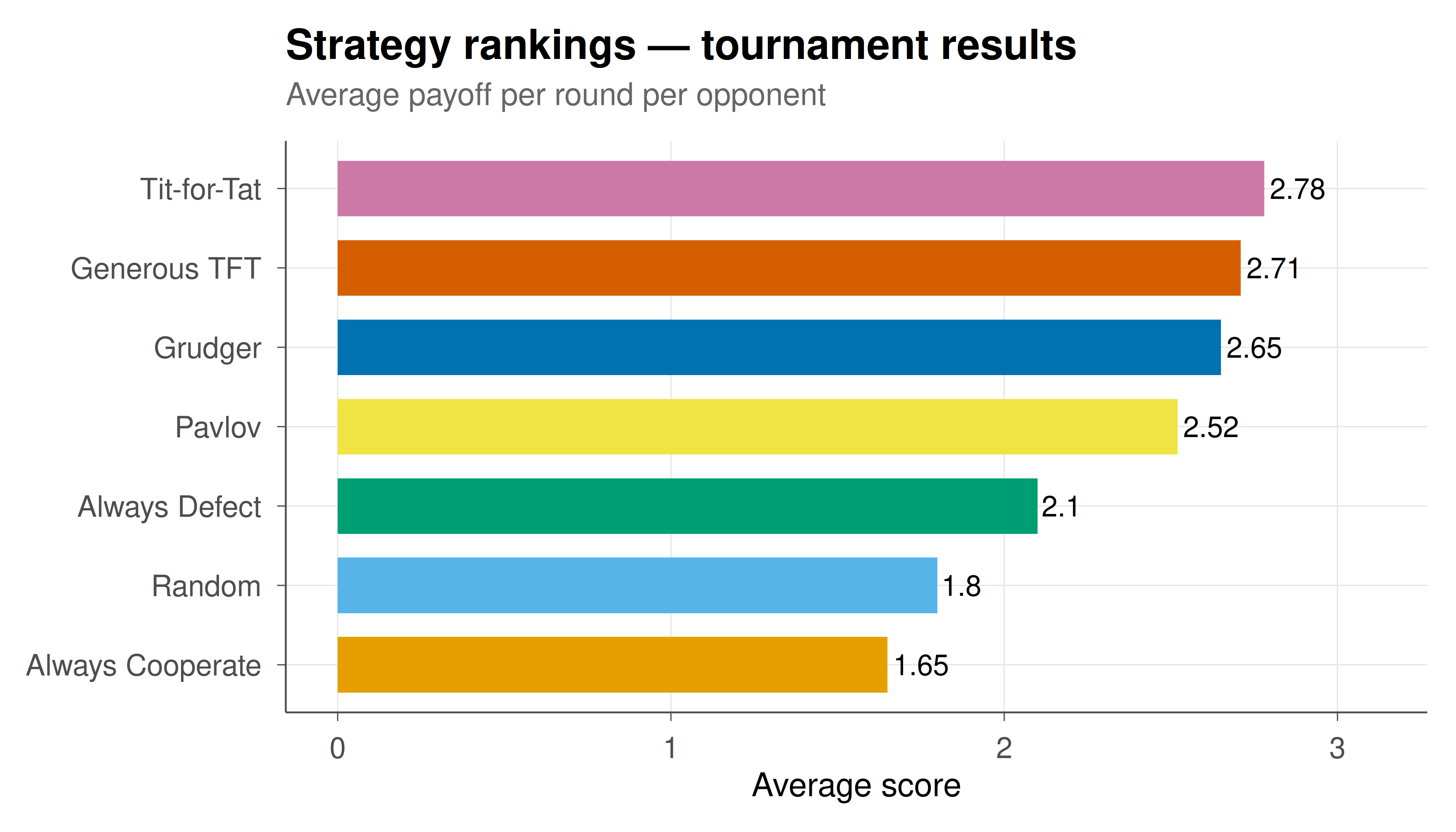
```{r}
#| label: fig-bar-showcase
#| fig-cap: "Figure 2. Horizontal bar chart with value labels, ordered by magnitude, and Okabe-Ito fill. Standard format for tournament results and strategy rankings."
#| dev: [png, pdf]
#| fig-width: 7
#| fig-height: 4
#| dpi: 300
bar_data <- tibble(
  strategy = c("Tit-for-Tat", "Grudger", "Pavlov", "Generous TFT",
               "Random", "Always Cooperate", "Always Defect"),
  score = c(2.78, 2.65, 2.52, 2.71, 1.80, 1.65, 2.10)
) |>
  mutate(strategy = reorder(strategy, score))

ggplot(bar_data, aes(x = strategy, y = score, fill = strategy)) +
  geom_col(show.legend = FALSE, width = 0.7) +
  geom_text(aes(label = round(score, 2)), hjust = -0.1, size = 3.5) +
  coord_flip(ylim = c(0, max(bar_data$score) * 1.12)) +
  scale_fill_okabe_ito() +
  labs(
    title = "Strategy rankings — tournament results",
    subtitle = "Average payoff per round per opponent",
    x = NULL, y = "Average score"
  ) +
  theme_publication()
```
### Line plot (time series)
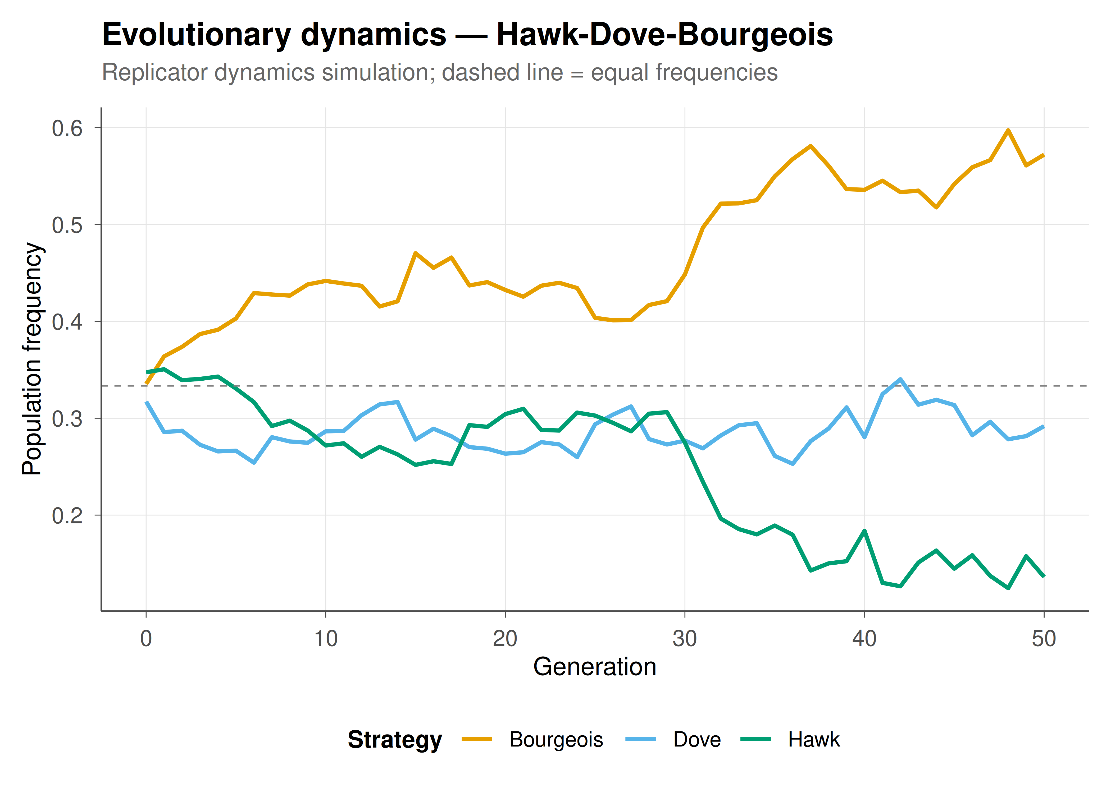
```{r}
#| label: fig-line-showcase
#| fig-cap: "Figure 3. Multi-series time plot with reference line and Okabe-Ito colours. Standard format for evolutionary dynamics, population frequencies, and convergence tracking."
#| dev: [png, pdf]
#| fig-width: 7
#| fig-height: 5
#| dpi: 300
set.seed(42)
ts_data <- tibble(t = rep(0:50, 3),
                   strategy = rep(c("Hawk", "Dove", "Bourgeois"), each = 51)) |>
  group_by(strategy) |>
  mutate(freq = case_when(
    strategy == "Hawk" ~ 0.33 + cumsum(rnorm(51, -0.003, 0.02)),
    strategy == "Dove" ~ 0.33 + cumsum(rnorm(51, -0.002, 0.015)),
    strategy == "Bourgeois" ~ 0.34 + cumsum(rnorm(51, 0.005, 0.02))
  )) |>
  ungroup() |>
  group_by(t) |>
  mutate(freq = freq / sum(freq)) |>
  ungroup()

ggplot(ts_data, aes(x = t, y = freq, color = strategy)) +
  geom_line(linewidth = 0.9) +
  geom_hline(yintercept = 1/3, linetype = "dashed", color = "grey50", linewidth = 0.3) +
  scale_colour_okabe_ito() +
  labs(
    title = "Evolutionary dynamics — Hawk-Dove-Bourgeois",
    subtitle = "Replicator dynamics simulation; dashed line = equal frequencies",
    x = "Generation", y = "Population frequency", color = "Strategy"
  ) +
  theme_publication()
```
### Heatmap
```{r}
#| label: fig-heatmap-showcase
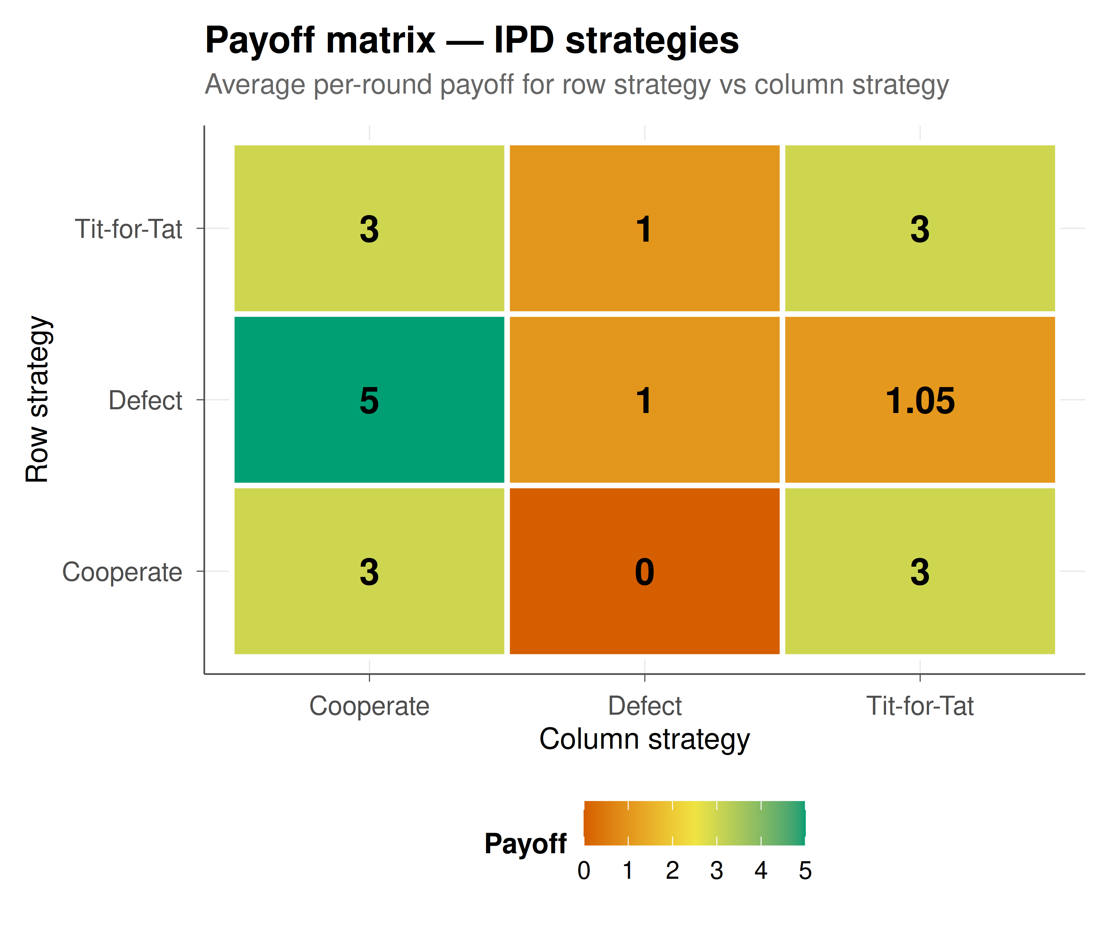
#| fig-cap: "Figure 4. Payoff heatmap with value annotations. Standard format for displaying payoff matrices, co-occurrence data, and correlation structures."
#| dev: [png, pdf]
#| fig-width: 6
#| fig-height: 5
#| dpi: 300
payoff_mat <- expand.grid(
  row_strategy = c("Cooperate", "Defect", "Tit-for-Tat"),
  col_strategy = c("Cooperate", "Defect", "Tit-for-Tat")
) |>
  mutate(payoff = c(3, 5, 3, 0, 1, 1, 3, 1.05, 3))

ggplot(payoff_mat, aes(x = col_strategy, y = row_strategy, fill = payoff)) +
  geom_tile(color = "white", linewidth = 1) +
  geom_text(aes(label = round(payoff, 2)), size = 5, fontface = "bold") +
  scale_fill_gradient2(low = okabe_ito[6], mid = okabe_ito[4],
                        high = okabe_ito[3], midpoint = 2.5,
                        name = "Payoff") +
  labs(
    title = "Payoff matrix — IPD strategies",
    subtitle = "Average per-round payoff for row strategy vs column strategy",
    x = "Column strategy", y = "Row strategy"
  ) +
  theme_publication() +
  theme(panel.grid = element_blank())
```
## Interactive conversion with plotly
```{r}
#| label: fig-interactive-showcase
# Any static ggplot can be made interactive
p_interactive <- ggplot(scatter_data, aes(x = x, y = y, color = group,
                                           text = paste0("Group: ", group,
                                                        "\nx: ", round(x, 2),
                                                        "\ny: ", round(y, 2)))) +
  geom_point(alpha = 0.6, size = 2) +
  scale_colour_okabe_ito() +
  labs(x = "Environmental parameter", y = "Payoff", color = "Strategy") +
  theme_publication()

ggplotly(p_interactive, tooltip = "text") |>
  config(displaylogo = FALSE,
         modeBarButtonsToRemove = c("select2d", "lasso2d"))
```
## Export pipeline
The dual export pipeline ensures every figure exists in both web-optimized PNG and vector PDF format:
```
#| dev: [png, pdf]
#| fig-width: 7
#| fig-height: 5
#| dpi: 300
```
These chunk options, applied consistently across all tutorials, produce:
- **PNG at 300 DPI**: crisp raster images for web display, suitable for Retina screens
- **PDF (vector)**: infinitely scalable for print publication, posters, and LaTeX inclusion
The `fig-width` and `fig-height` are in inches and control the aspect ratio. For landscape plots (time series, bar charts), use 7×5 or 8×5. For square plots (heatmaps, scatter), use 6×5 or 7×6. For wide multi-panel layouts, use 10×5 or 10×6.
## Interpretation
Consistent visualization is not a cosmetic concern — it is a prerequisite for credible scientific communication. The theme and palette system demonstrated here serves three purposes. First, **accessibility**: the Okabe-Ito palette ensures that roughly 300 million people worldwide with colour vision deficiency can read every figure on this site. Second, **reproducibility**: by encoding all style decisions in a single `theme_publication()` function and two scale helpers, we eliminate the ad hoc colour and font choices that make figures inconsistent across articles and authors. Any contributor can produce a figure that matches the site's visual language by calling `theme_publication()` instead of manually setting dozens of theme elements. Third, **professionalism**: the dual PNG/PDF export pipeline means every figure is ready for both web embedding and print submission without manual re-rendering. These design choices cost minutes to implement but save hours of reformatting and prevent accessibility failures. Every tutorial on this site uses this exact setup — the consistency is itself a form of documentation.
## Extensions & related tutorials
- [Mixed-strategy Nash equilibrium in 2×2 games](../../foundations/nash-equilibrium-mixed/) — uses this theme for best-response plots.
- [Axelrod's IPD tournament](../../classical-games/iterated-prisoners-dilemma-axelrod/) — uses this theme for ranking bar charts.
- [Replicator dynamics for RPS](../../evolutionary-gt/replicator-dynamics-rps/) — uses this theme for time-series and simplex plots.
- [Spatial Prisoner's Dilemma](../../simulations/spatial-prisoners-dilemma-nowak-may/) — uses this theme for lattice snapshots.
- [Advanced plotly techniques](../advanced-plotly-game-theory/) — going beyond ggplotly for custom interactive visualizations.
## References
::: {#refs}
:::